Salveo
Intro
In 2019, Nudge entered a merger with a company called Salveo Diagnostics. Their goal was to start offering direct-to-consumer lab testing, and they wanted to utilize our app to deliver results and provide coaching services. As part of the merger, I became Design Director of the new company. My first task was to create a new brand, but in the course of the first year, I helped design everything from how tests were ordered to how patients were billed.
Branding
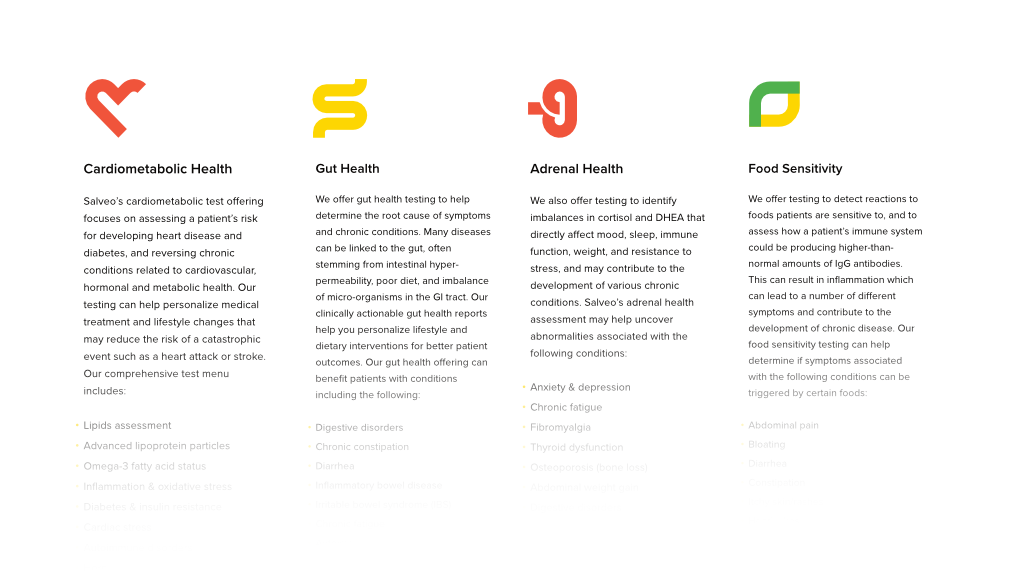
As I got to know the doctors and scientists that made up Salveo’s leadership team, I noticed a phrase that kept coming up time and time again: “The path from red to green.” This was central to the connection between the test and how the patient responded to it. It was also core to the value we provided. So much of the insight we had to offer was summed up in the cutpoints. In our culture, there is an intuitive meaning to red, yellow, and green. Upon being placed within a given range, a patient is motivated to see their results move from red to green. As I ideated on what a new logo should be, I knew the path from red to green had to be the central idea.
We talked extensively about how results aren’t a destination but an invitation to better health. In fact, there was a great desire to move away from the term “result” entirely. Patients are on a path; we are connecting the dots. This is easily my favorite logo I have ever designed, chiefly because each piece of it is so intentional. Later, when we finalized the different categories of tests we would offer, I expanded upon the path concept with a series of logos to represent each category, made from a single path like the main logo.
I created a brand guide, something I hadn’t done since before my days working in software. I really enjoyed the process of defining a simple and straightforward visual language and writing style. There was a great focus on clarity, simplicity, and sincerity. We considered the semantics of everything we were doing, which resulted in a brand guide that was both concise and dense with meaning and intention.
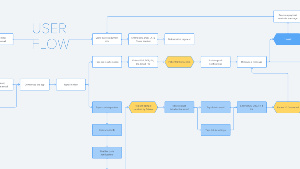
User Flow
The primary reason we had come together was to create a new version of our app focused on delivering direct-to-consumer lab results. I started by meeting with our various teams and defining a user flow. We had to consider pretty disparate entry points, such as receiving a test from your doctor versus purchasing a take-home test from the store.
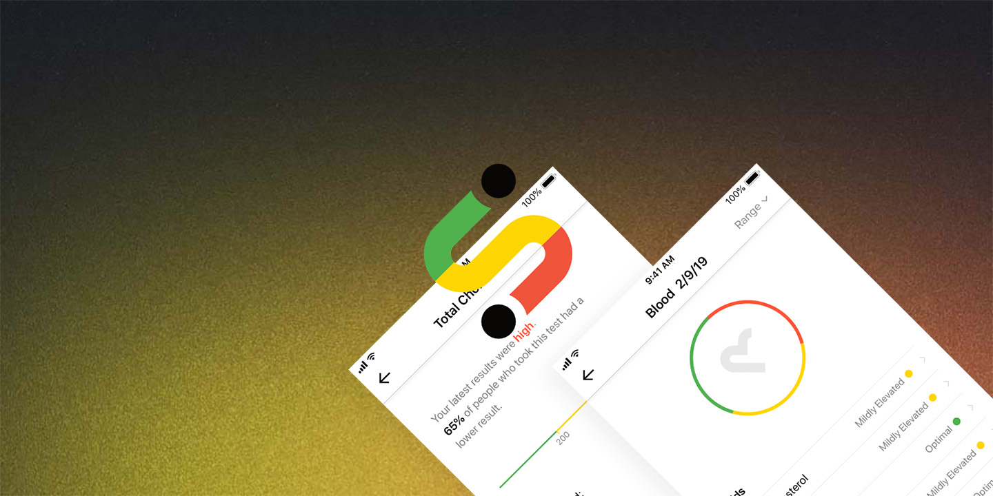
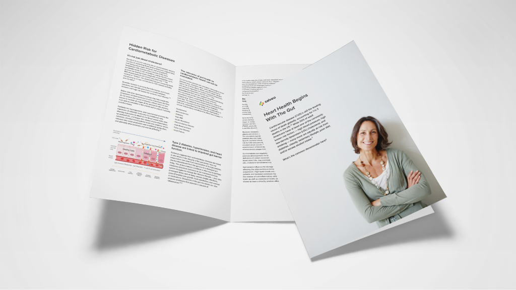
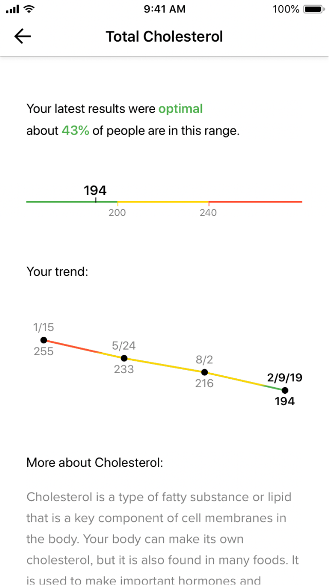
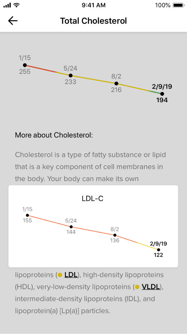
Digitizing Lab Results
A key requirement of the new app was to present digitized lab results. Rather than trying to cram their existing design into a phone screen, I took the opportunity to completely redesign the report from the ground up, taking into consideration how each element would translate between print and app.
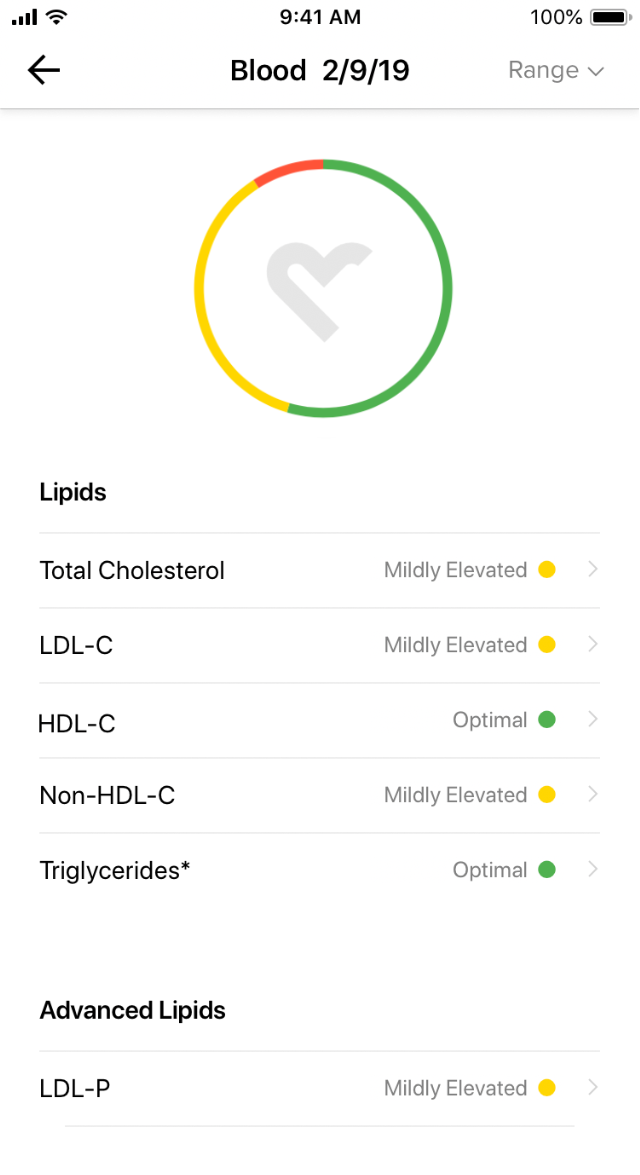
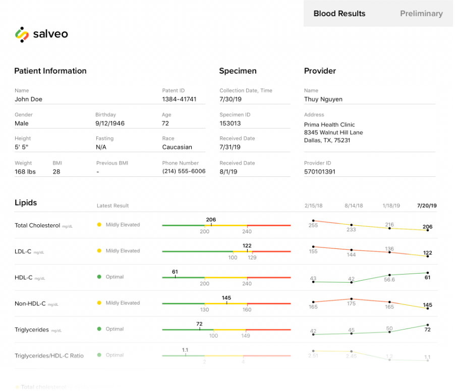
One of the key tools to providing a consistent experience between the print and app versions was the visualizations I prototyped and developed during the design process. I wrote these in React, and we were able to plug them into their pre-existing system for generating printed lab reports. This way, the app and the printed report visualized data in the exact same way.
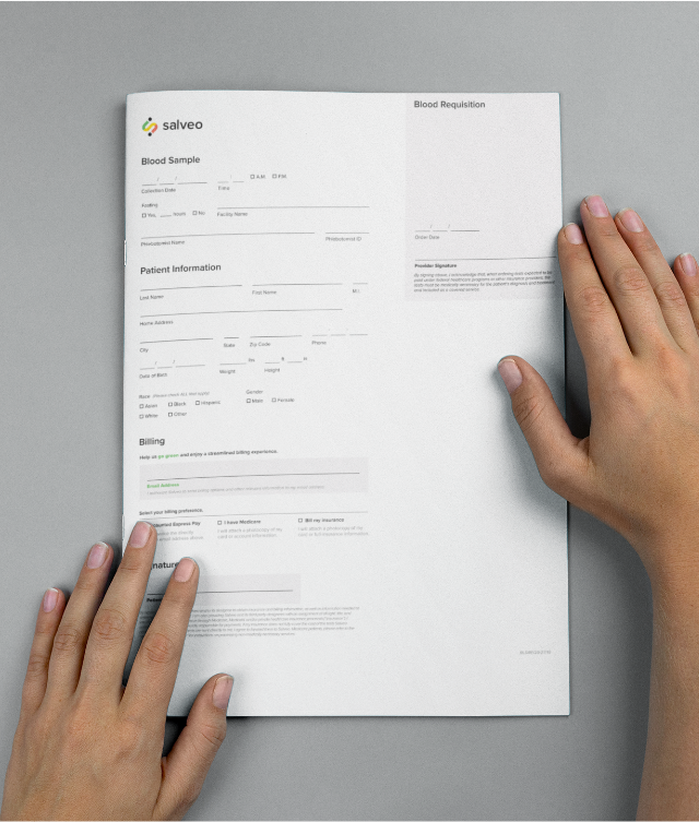
Rethinking Requisitions
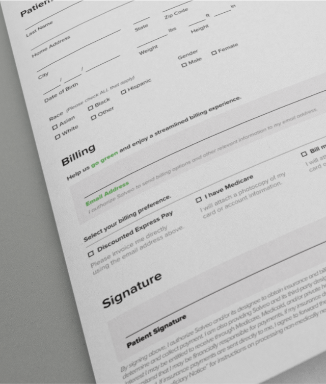
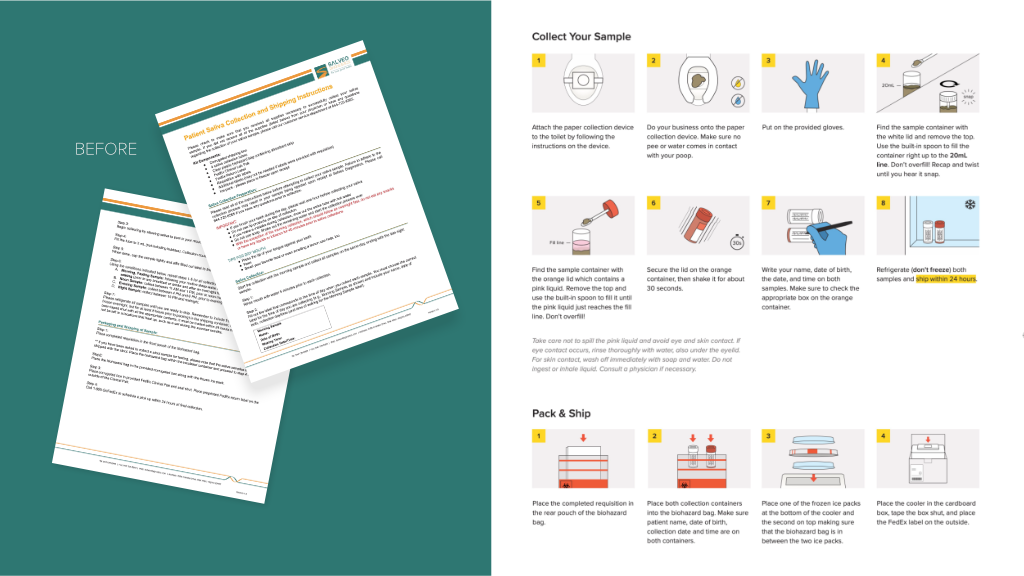
As part of trying to bring good design to the entire patient experience, I turned my attention to the way in which samples are collected. Being someone that has a hard time following directions, I naturally have empathy for people who struggle with overly technical and hard-to-follow instructions. Especially those seeking medical attention, which already brings its own anxieties. I took great pleasure in replacing all the doctor-speak with common language and injecting a little humor along the way. To me, this was more respectful of the patient. Multiple pages of instructions became one simple page with illustrations.
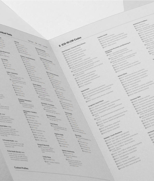
I even helped rethink the way tests were ordered. While much less freedom was found here, I did make great strides in creating more legible forms with a clear design system that worked across all types of order forms. The added continuity greatly cut down on the potential for error as there was better consistency between one form and the next.