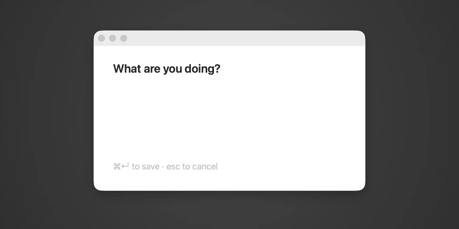
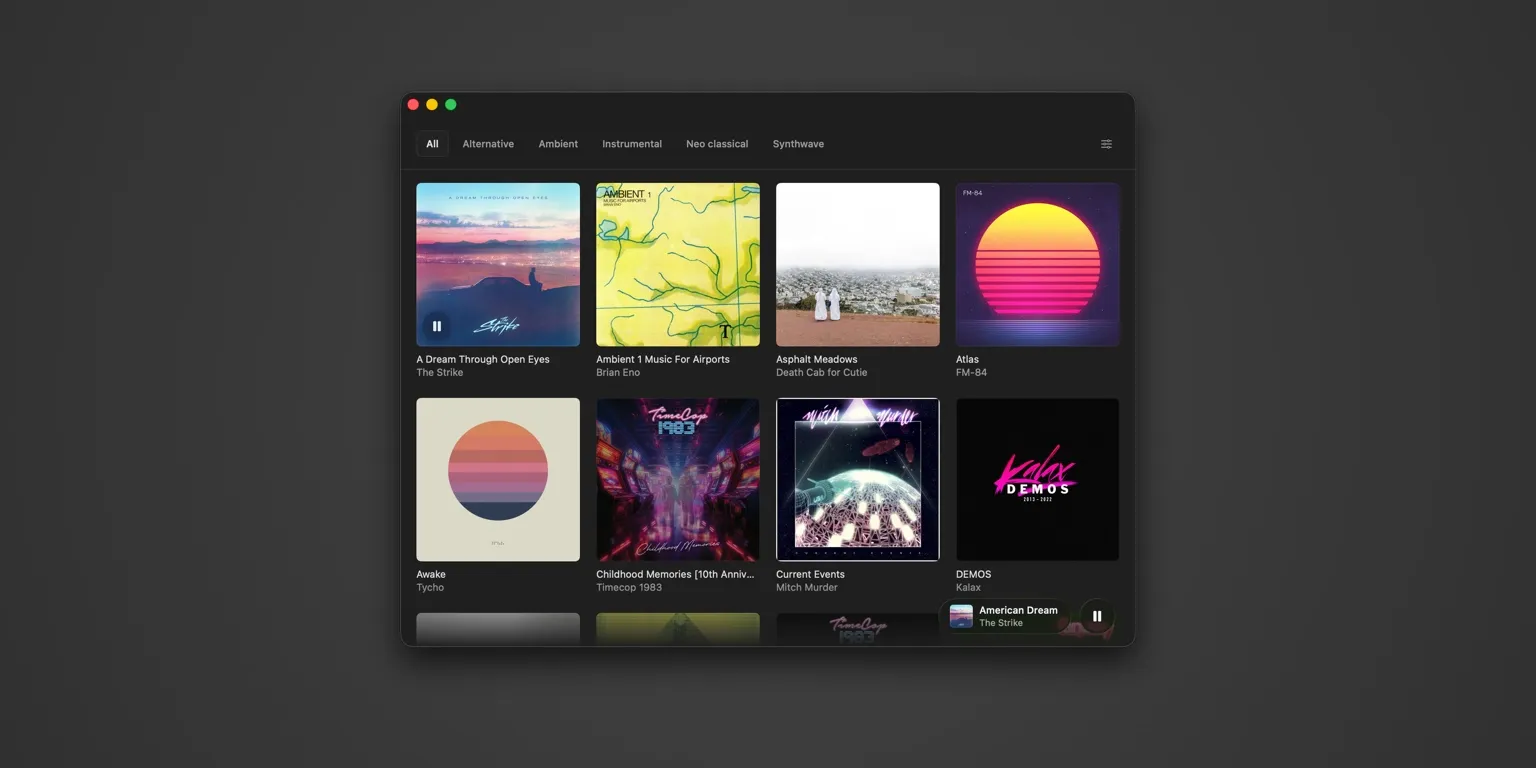
Apps


Intro

I have a deep-rooted passion for creating things. The App Store created a great opportunity for people that want to release software products themselves. These are a few of the personal app projects I’ve worked on in the last 10 years and the first commercial app I helped design.

Patterns

Patterns is a habit tracking app I worked on with a friend back when I still had some free time to spend on side projects. Believe it or not, we had it fully working but never released it. The idea was to make habit tracking as simple as possible by tagging the current moment in time by simply tapping on a button.

Visually, I was inspired by Vignilli’s design of the New York subway system map. By generating a 2-letter code for each button and letting the user select a color, a unique button is created that can be tapped to tag the moment. Color provides a subtle way for a user to link habits together.

Patterns was the first app I worked on that was written entirely in Swift. I developed the frontend code for it. The backend was built upon Firebase by a friend of mine. It still remains one of my better unreleased projects. I keep thinking I may return to it someday.

Liftium

Liftium is my most successful side project. It was created during a time where weightlifting was a major interest of mine and I didn’t like any of the apps out there. My main complaint was that every app I tried assumed a predetermined workout and that wasn’t how I lifted. I go to the gym with some idea of what muscles I want to target, generally based on what hasn’t received attention lately. Then I construct a workout on the fly based on what equipment is available at the moment. Liftium supported this workflow by allowing the user to enter exercises as they go. The app shows the breakdown of what muscles you targeted during your workout. It even names your workout for you.

While I’m certain most people look for an app that tells them how to work out, Liftium found a healthy following with more well-informed lifting enthusiasts. One of the more iconic elements of the design was the calendar view that plotted your workouts with a labeling scheme reminiscent of a periodic table. This is largely why the name Liftium was adopted.

Liftium on iOS is coded almost entirely in Objective-C with a CoreData backend. The graphing portion is written in Swift. While I always prefer to write code with the native language, I ultimately struggled to maintain Liftium partly due to the fact that I didn’t use Objective-C or Swift in my day job, which made keeping up with iOS updates all the more challenging.

I later developed an Android version using techniques I’d cultivated while working on Nudge’s PhoneGap-based app. This led to what I really saw as the future of the app: a web-based platform that could be accessed from any device, from desktop to mobile. While the Android version was released in 2017, the website never launched. Ultimately, the demands of my role as Product Owner of Nudge left me with little energy to maintain Liftium. If I ever pick this project back up, I’ll continue with the web-based version. I still really like the design.

Helo TC

After transitioning to UI Design from a career in Graphic Design/Advertising, my second job was at Griffin Technology. There, I had the opportunity to work on the interface for the first Bluetooth remote control helicopter for iPhone. I loved working with custom physical hardware, something I haven’t really done before or since. This was still relatively early in the iPhone’s life and there weren’t many examples to draw from. This was the first device of its class that I’d ever seen.

At the time, there was a large focus on what’s now called “skeuomorphic” design. This meant making the UI look as physical and realistic as possible. In congruence with design from this time period, I did spend a lot of time on these details, but my main focus was on usability. The way I saw it, the user’s eyes aren’t on the screen but on the toy. I wanted the most important elements of the UI, the flight control mechanisms, to stand out when you glanced down. This is the reason most of the UI is so subdued. If you squint, you should only see the flight controls.

I was also responsible for the app icon, for which I created an illustration of the product itself. I certainly don’t consider myself an illustrator, but I enjoy illustrating when the project calls for it. Finally, I had to work through the UX of various error scenarios and how to inform the user on what steps to take. The example below shows what happened when the tracking device wasn’t detected.